La Maison Patisserie
Transforming a fragmented e-commerce experience into a cohesive storefront.
Overview
Scope: Full responsive e-commerce redesign (14+
screens across mobile & desktop)
Deliverables: UX audit, wireframes, UI system,
HTML/CSS prototype
La Maison Patisserie is an independent bakery with an existing online store. This project involved auditing the current website and redesigning the full digital experience to improve clarity, accessibility, and structural consistency.
The redesign translated audit findings into a cohesive design system and scalable front-end implementation across mobile and desktop experiences.
Impact Focus
While no formal usability testing was conducted, the redesign prioritised clarity, accessibility, and system consistency to reduce friction in product discovery and checkout progression.
The Problem
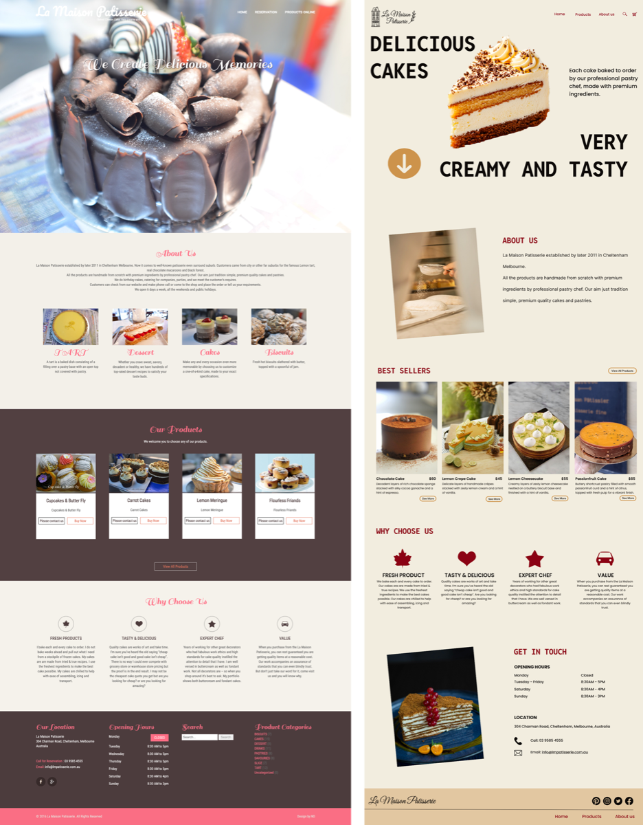
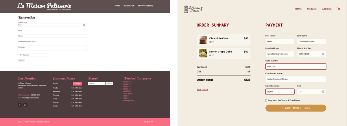
The original website suffered from multiple usability issues that disrupted both readability and purchasing flow.
Key issues identified:
- Low-contrast colour combinations reducing readability
- Inconsistent typography hierarchy
- Unclear navigation structure
- Missing functional cart and checkout flow
- Poor responsiveness across breakpoints
These issues created cognitive load and reduced confidence during product discovery and purchase.
Audit Findings
A structured UX and accessibility audit was conducted across mobile and desktop experience to identify the root causes behind these issues.
The audit revealed that problems were not isolated, but systemic.
Primary insight: The absence of a unified design system created inconsistencies in hierarchy, interaction, and accessibility.
This resulted in:
- Inconsistent visual structure
- Unpredictable interaction patterns
- Reduced clarity across the user journey
Design Goals
Based on the audit, the redesign focused on system-level improvements rather than surface-level styling.
Core goals:
- Establish a structured typographic and spacing system
- Improve colour contrast and accessibility compliance
- Simplify navigation architecture and product discovery
- Reduce cognitive load in cart and checkout flow
- Implement a consistent mobile-first responsive framework
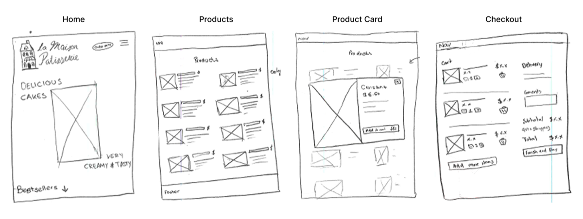
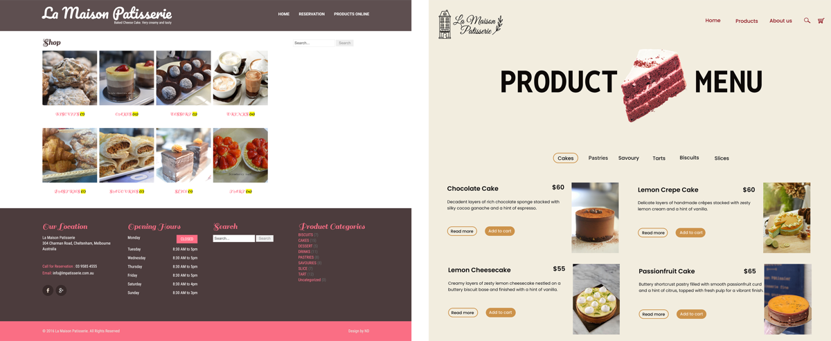
Structural Redesign
The original site lacked hierarchy and clear product discovery.
Key structural changes:
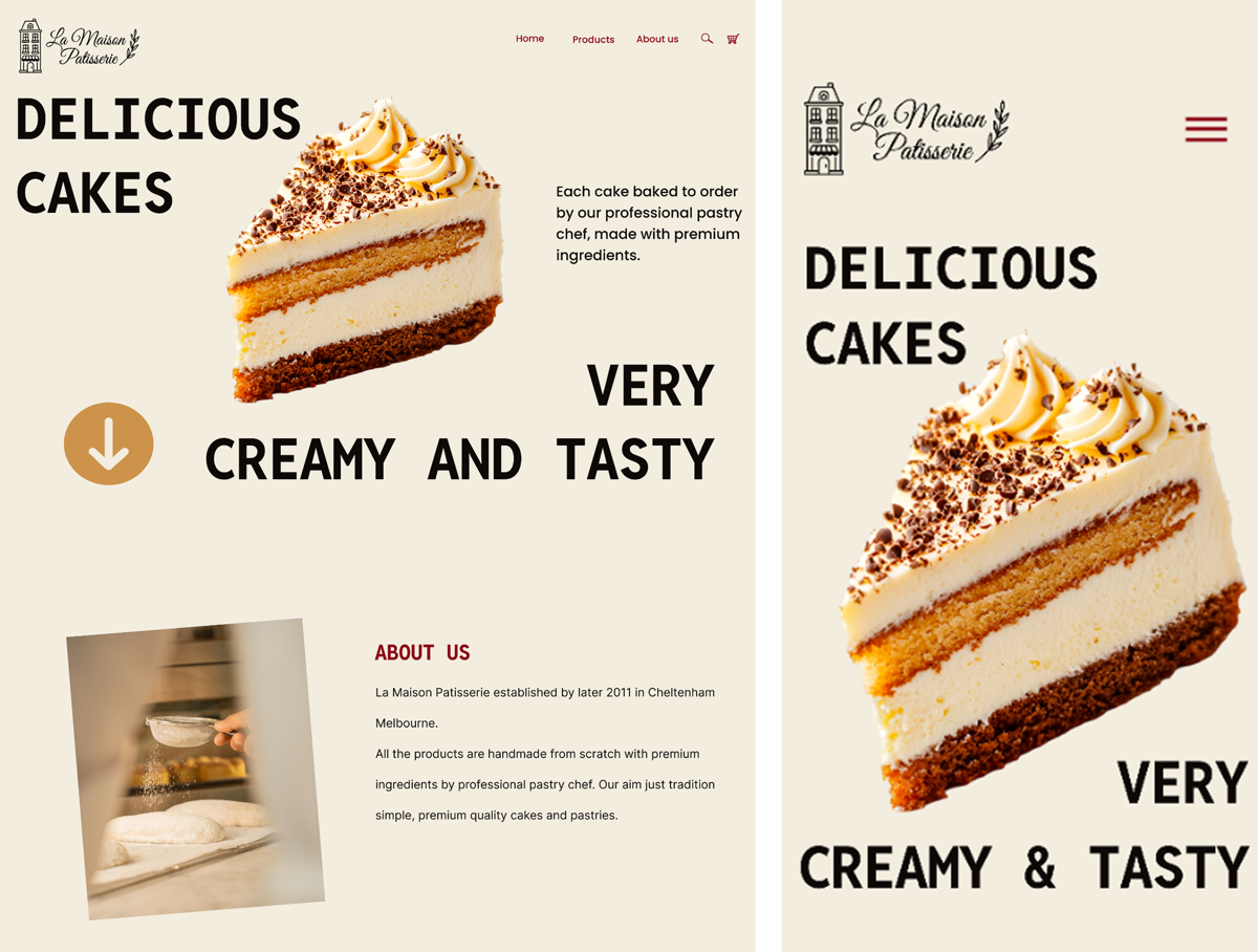
- Refined homepage layout to improve visual hierarchy and reduce clutter
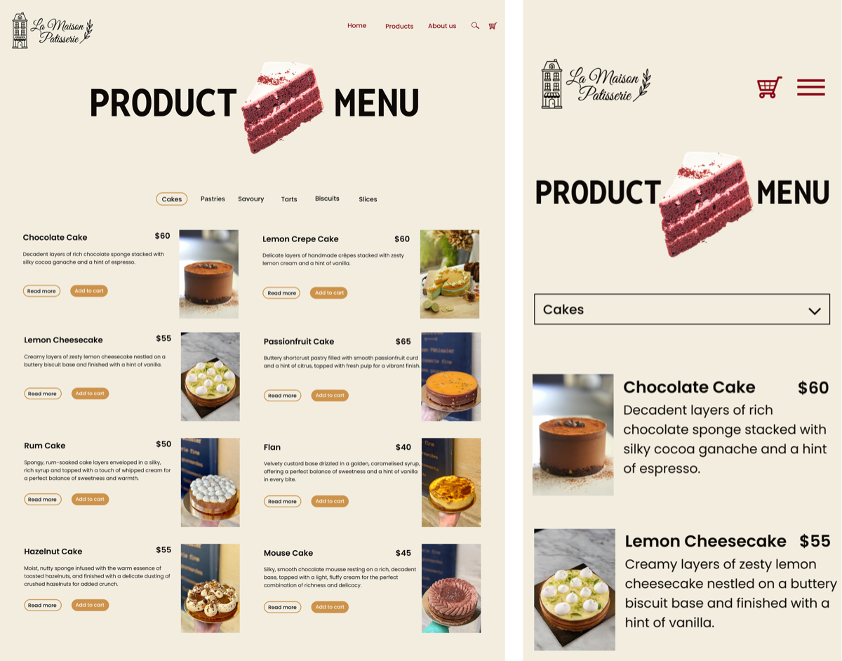
- Redesigned product listing from a dense image grid to a structured two-column layout
- Introduced clearer product information (name, description, price) accessible during browsing
- Made filtering and navigation elements more accessible and visible
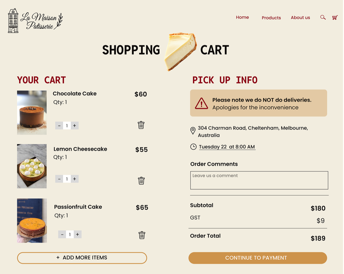
Interaction Improvements
The redesign focused on reducing ambiguity and improving task clarity.
Improvements included:
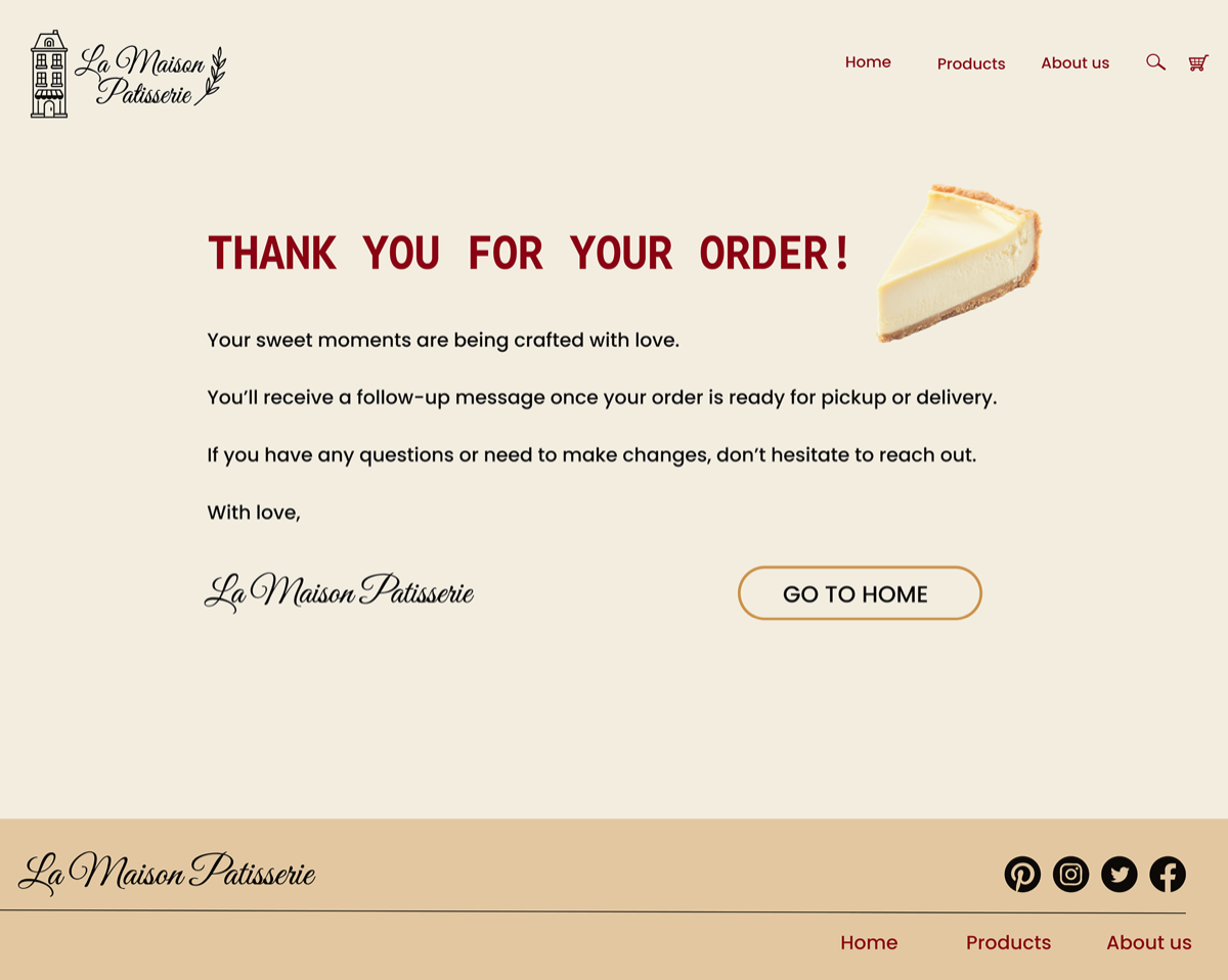
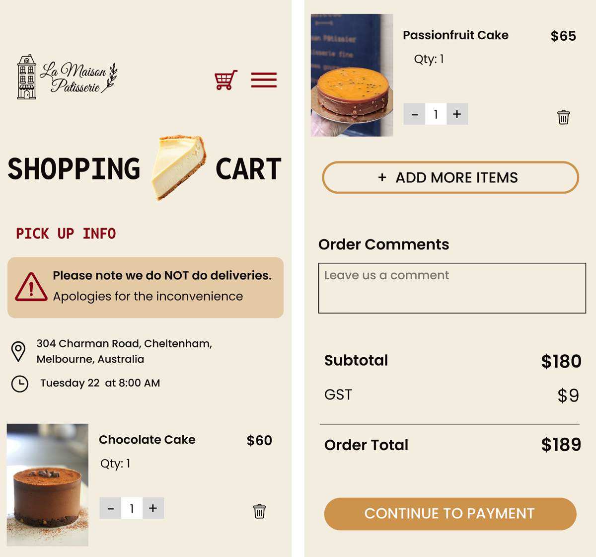
- Clear cart feedback states
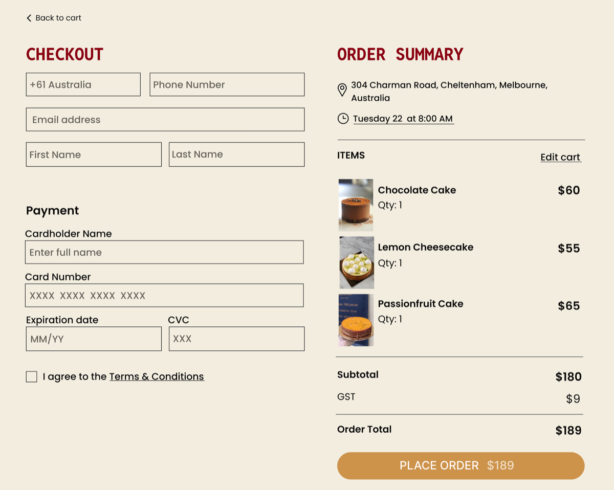
- Structured multi-step checkout flow
- Improved form hierarchy and input clarity
- Stronger call-to-action contrast
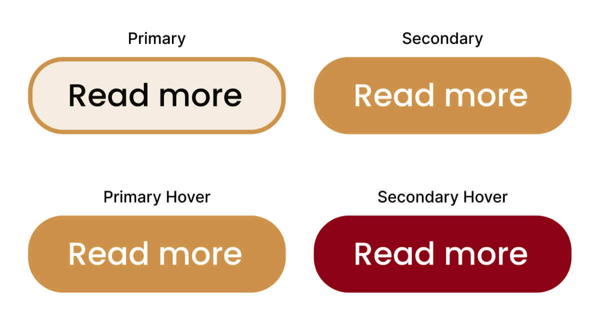
- Consistent button behaviour across screens
Design System Development
The original site lacked consistency across typography and colour usage.
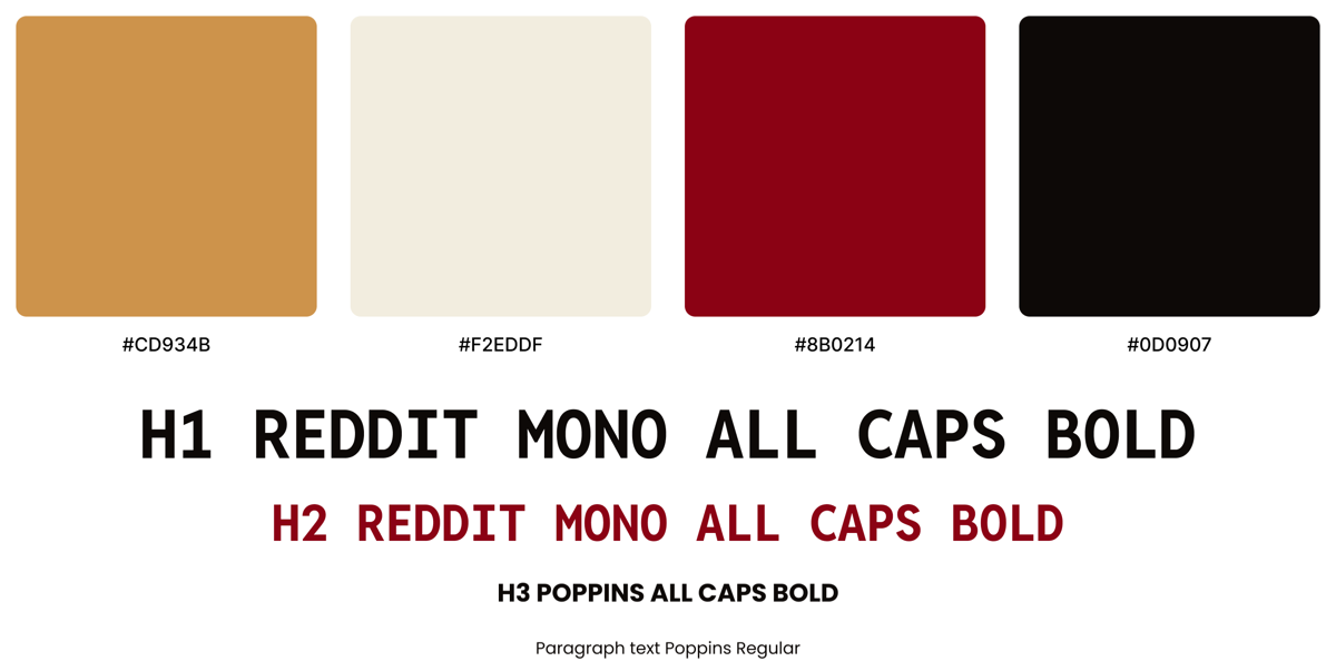
To create cohesion, I defined:
- A structured typographic system
- Accessible colour palette validated against WCAG contrast standards
- Consistent spacing system
- Defined button states and interaction styles
Responsive Implementation
The redesign was developed across mobile and desktop breakpoints.
Focus areas:
- Mobile-first layout adjustments
- Touch-friendly interaction zones
- Optimised content stacking for smaller screens
Reflection
- System-level thinking — Approached redesign by identifying underlying structural issues rather than applying surface-level visual changes.
- From audit to system — Translated usability and accessibility findings into a consistent UI framework to improve clarity across screens.
- Accessibility as a foundation — Integrated WCAG considerations into colour, typography, and interaction decisions throughout the design.
- Next steps — Usability testing would validate task clarity and measure improvements in product discovery and checkout flow.
View Project
Live website · Desktop prototype · Mobile prototype · GitHub repository