Fish Tales
Making sustainable seafood transparent, accessible, and shelf-competitive.
Overview
Scope
Brand strategy, packaging system, and
visual identity
Deliverables
Packaging (3 SKUs), tin design,
visual system, digital applications
Role
Led packaging concept, fishing method
illustrations, tin design, and digital applications. Co-led research
and brand strategy.
Fish Tales is a tinned seafood brand designed to bridge the gap between low-cost supermarket products and high-end specialty brands. The project focused on making sustainability transparent and accessible through packaging, material choice, and visual storytelling.
Market Gap
The Australian tinned fish market is polarized:
- Supermarket brands: affordable but generic, with vague sustainability claims
- Specialty brands: transparent and well-designed, but expensive
Gap: No brand combines affordability, transparency, and strong visual identity.
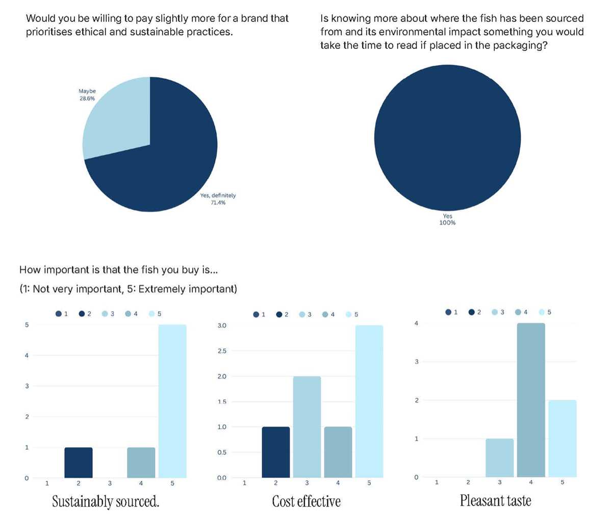
Research Insights
Focus group (7 participants, 19–55):
- 85% rated sustainability extremely important
- 71% preferred modern/minimal packaging
- 100% would read sourcing info on pack
- 71.4% willing to pay more for sustainable product
Key takeaway: Sustainability matters, but only when it is clearly communicated and visually accessible at the point of purchase.
Brand Strategy
Position: Accessible sustainability, making ethical sourcing visible, understandable, and affordable.
Design principle: Make sustainability explicit, not implied.
Target: 20–40 year olds, ethically minded, design conscious, urban.
Price point: $3.49 per tin — accessible but elevated.
Design System
Fish Tales was developed as a cohesive visual system designed to communicate sustainability clearly while remaining commercially competitive.
Key Components
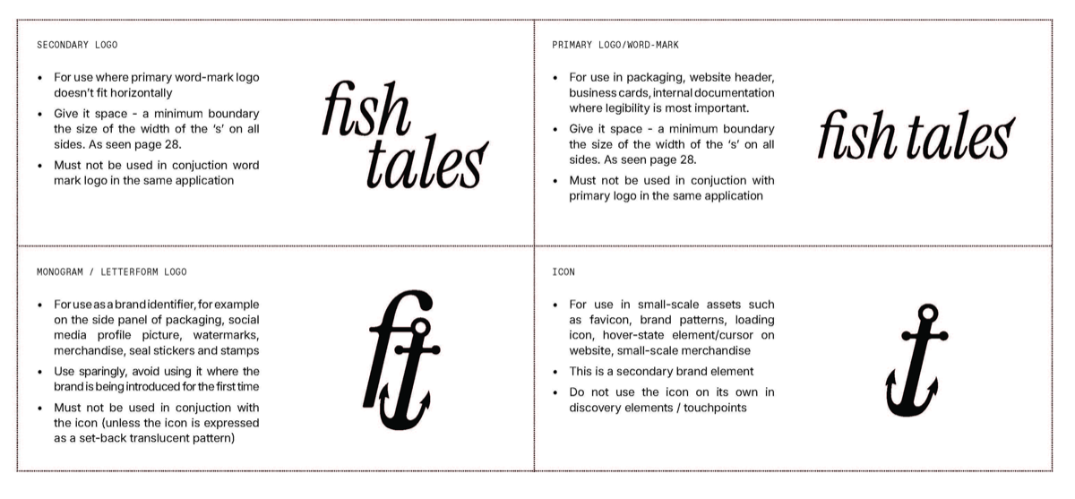
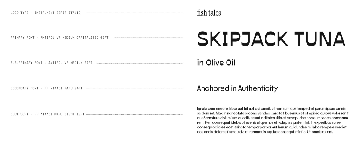
Logo & Typography
A clean, contemporary wordmark paired with a structured typographic system to balance credibility and approachability.
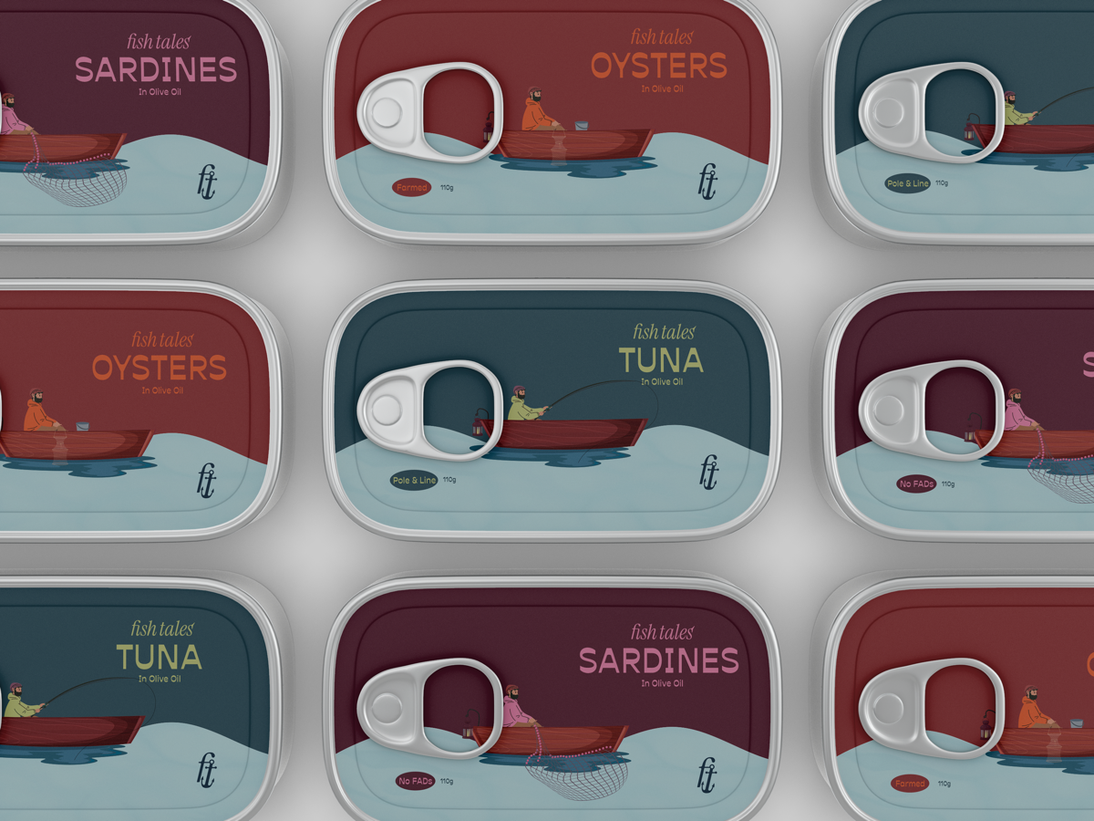
Colour System
- Primary: muted ocean blues → trust and stability
- Secondary: product-specific accents
- Tuna → Sea Grass
- Sardines → Sailor’s Warning
- Oysters → Sailor’s Delight
This creates both consistency and clear product differentiation.
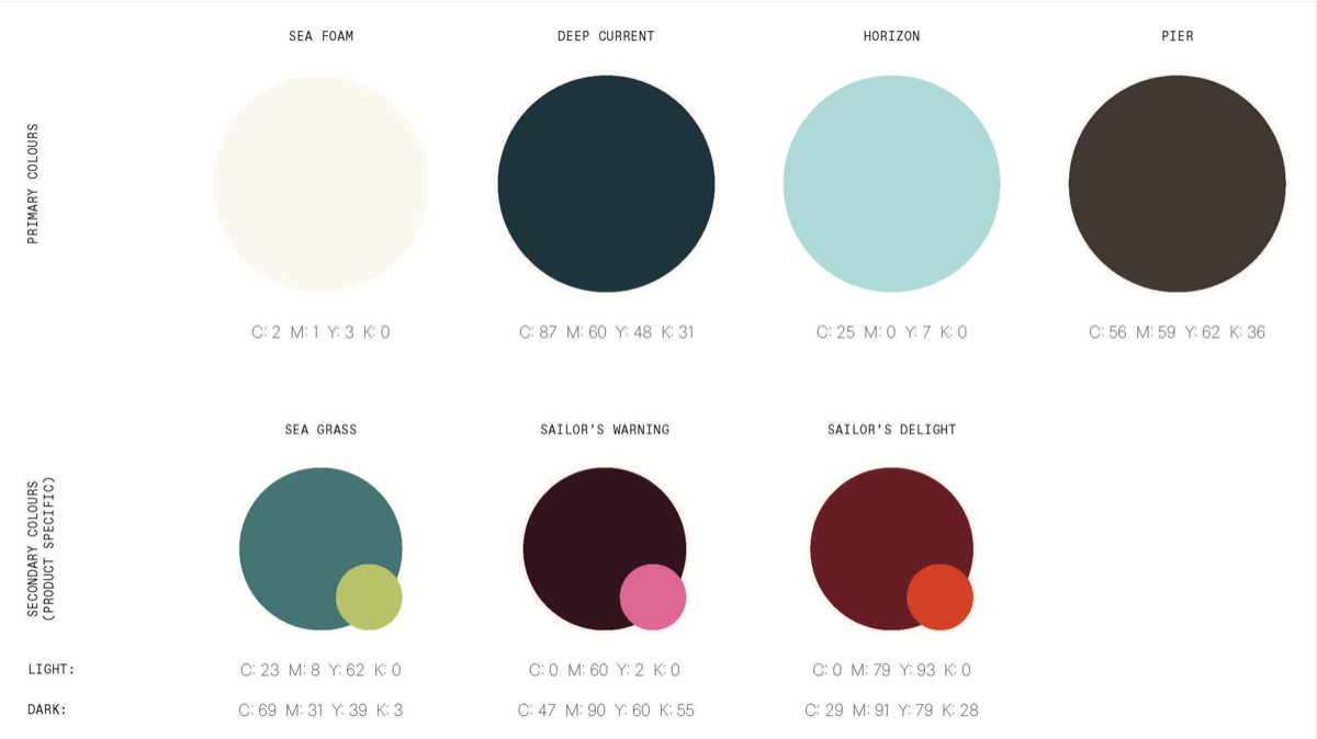
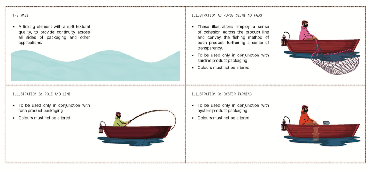
Illustration Style
Hand-drawn then vectorised illustrations showing fishing methods:
- Pole & Line (Tuna)
- Purse Seine without FADs (Sardines)
- Oyster Farming
These make sustainability specific and legible, rather than abstract.
Material Strategy
100% recycled kraft board with minimal ink coverage
→
sustainability is communicated through material honesty, not just
messaging
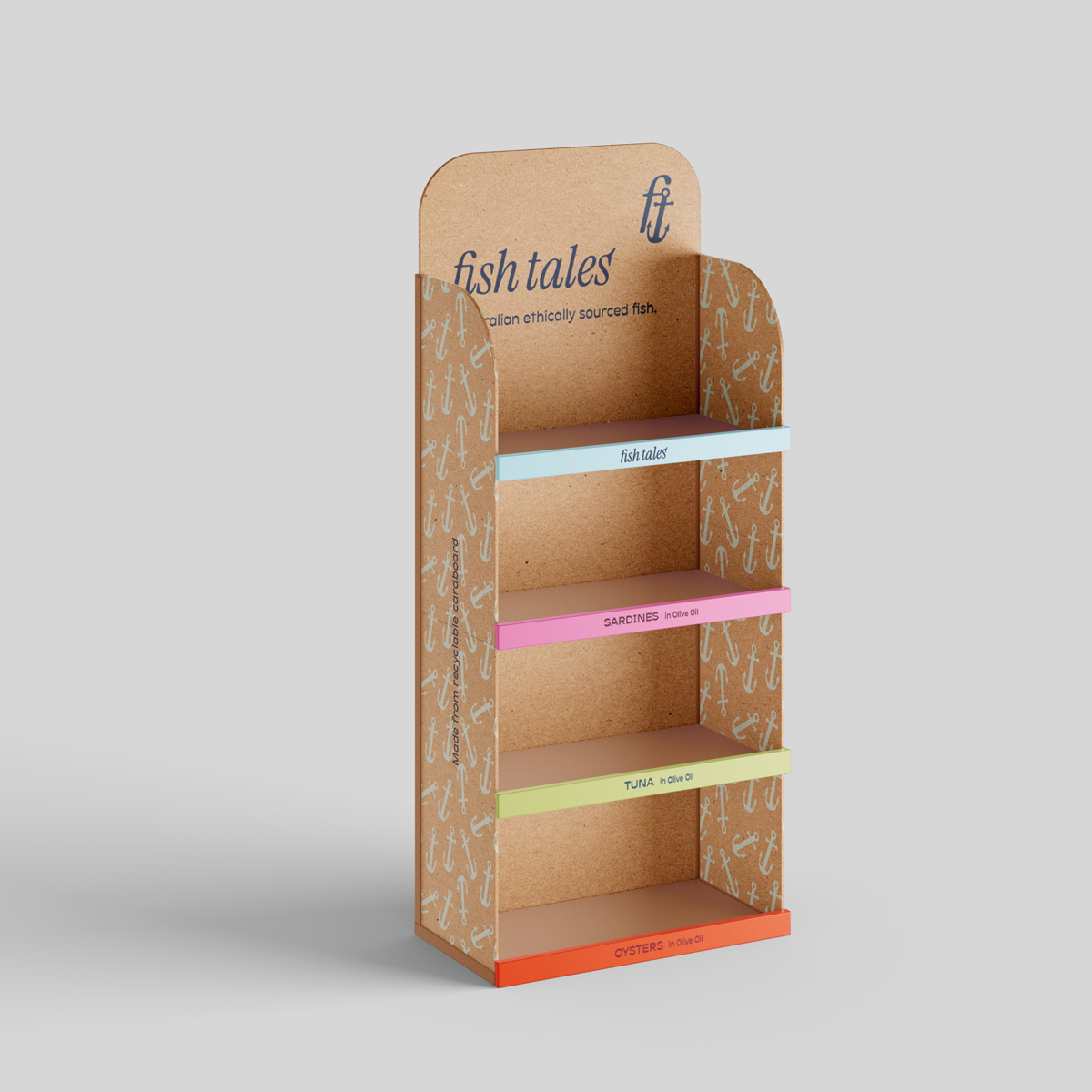
Packaging System
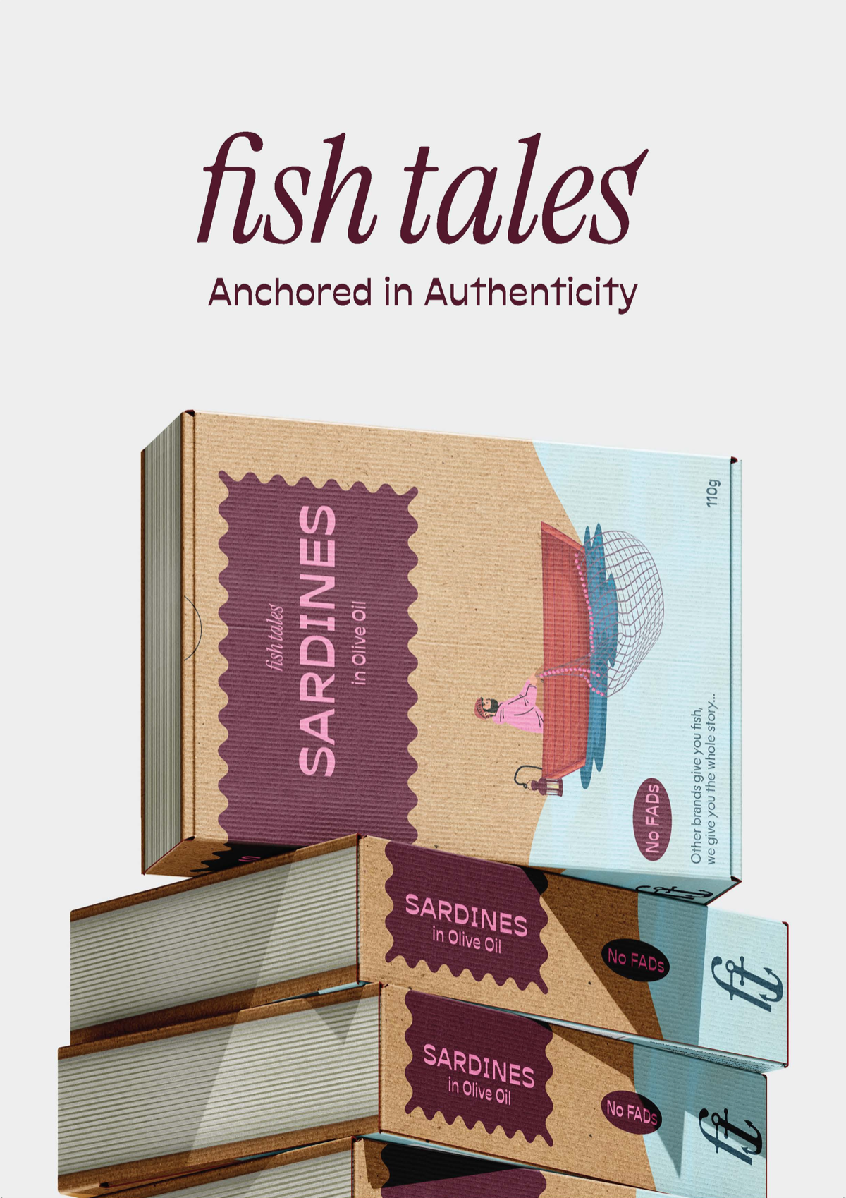
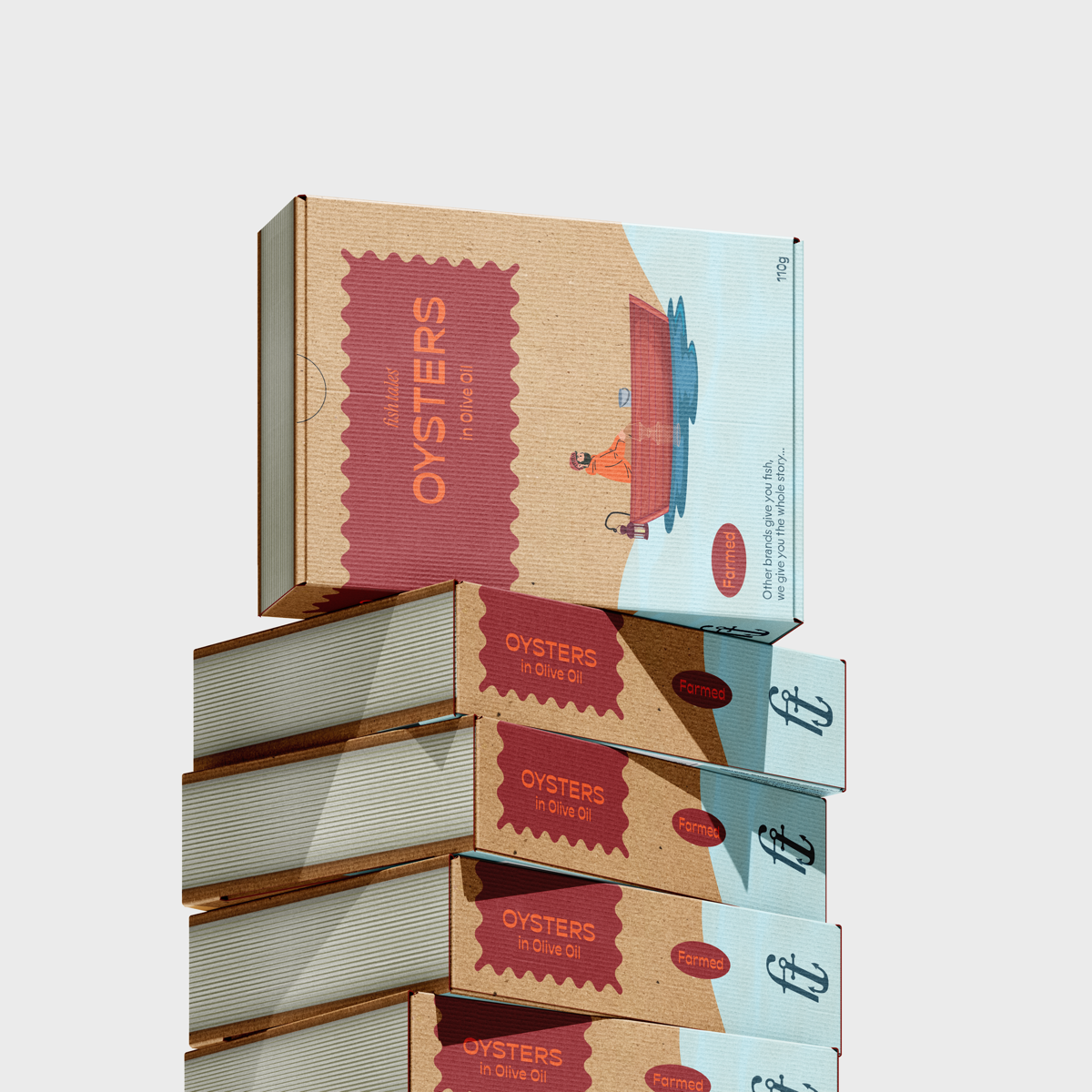
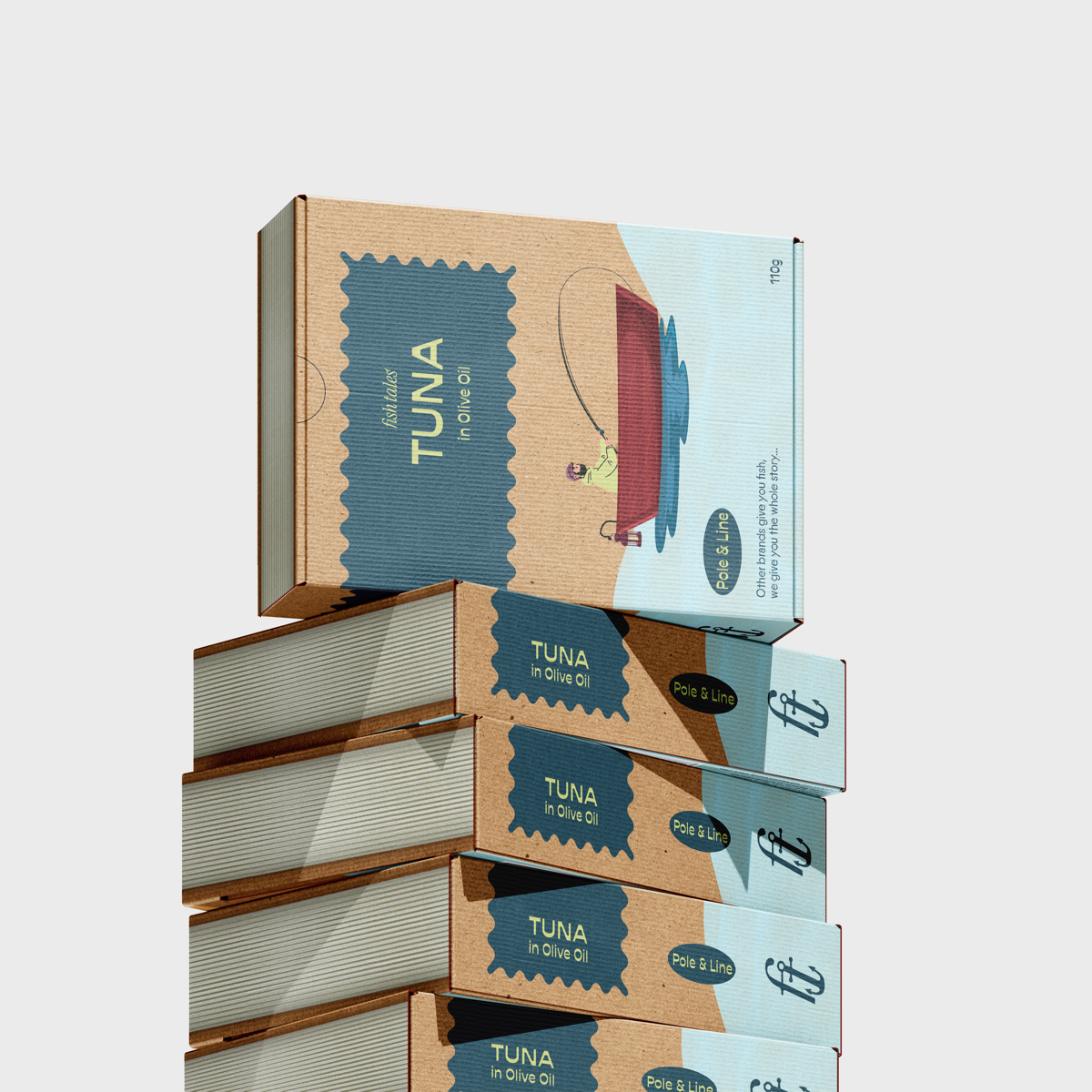
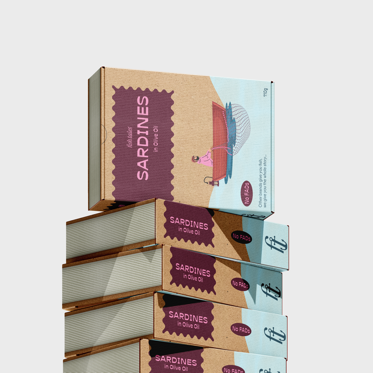
The packaging brings the Fish Tales concept to life by turning each product into a story book, combining the brand name, sourcing method, and packaging narrative to create an engaging shelf presence.
Key Decisions
Book-Inspired Structure
A portrait format referencing a story book telling you the tale of the fish:
- Front → product identity
- Spine → shelf recognition
- Back → sourcing story
This creates a more narrative, engaging experience.
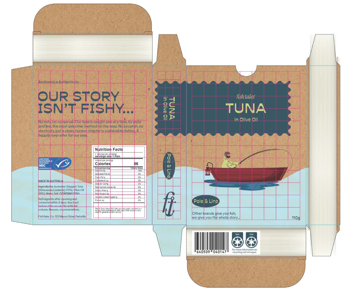
Information Hierarchy
Packaging prioritises:
- Product recognition
- Fishing method + sourcing
- Supporting story
Making ethical information immediately accessible.
Tin Design
Tin design extends the same hierarchy and product differentiation cues, reinforcing clarity and brand consistency across formats.
Final Outcome
The final packaging system includes:
- 3 product variants
- Tin designs
- Product stand mockup
- Promotional poster
The result is a product that stands out on shelf while remaining informative and accessible.
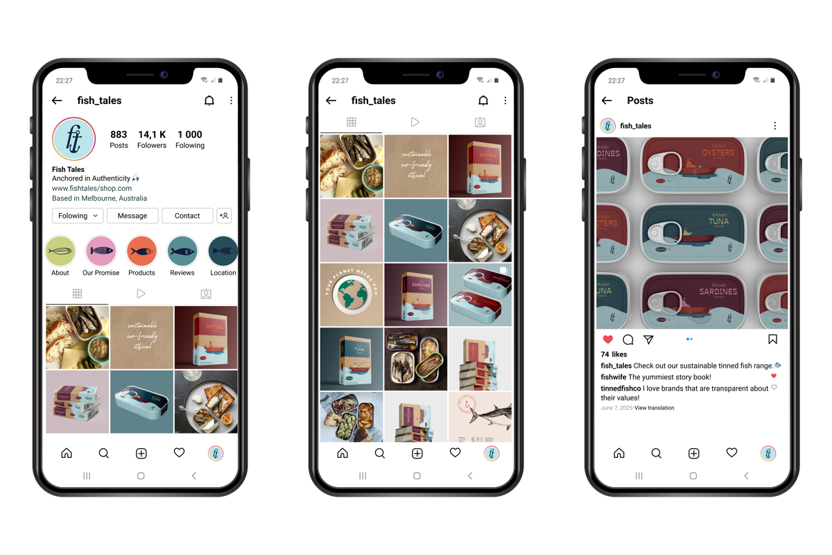
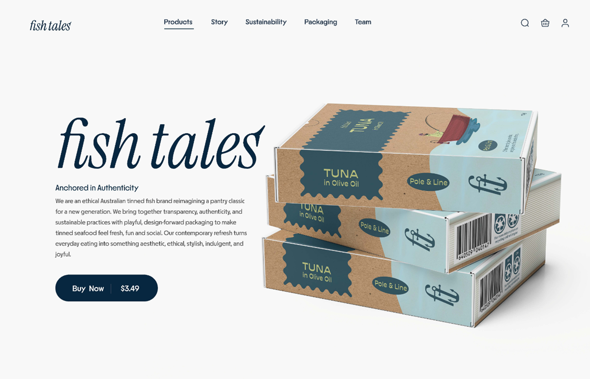
Brand in Application
The system was designed to scale across physical and digital touchpoints.
Digital applications include:
- Social media system
- Website prototype (Figma)
This ensures consistency while adapting to different contexts and user interactions.
Reflection
- Specificity builds trust — Clearly communicating fishing methods and sourcing on-pack made sustainability tangible rather than abstract.
- Balancing premium and accessible is essential — Early iterations felt overly exclusive; refining the colour system and material use created a product that feels elevated while remaining approachable for a supermarket context.
- Material can function as storytelling — Printing on 100% recycled boxboard, with areas intentionally left unprinted, allowed the material itself to communicate sustainability.
- Category constraints can still enable distinction — Familiar visual cues (muted blues, structured layouts) maintain trust, while brighter accents introduce differentiation and a more contemporary tone.